see the work
A system built for order made healthcare feel heavy.
Maricopa County CHS employees stayed devoted to their mission even as structural constraints made work difficult.
Our Culture Gap Analysis was illuminating—revealing what worked, what didn’t, and what was needed to cultivate the kind of workplace culture they all craved.
A proud city needed help rising to meet a historic moment.
The City of Santa Clara needed a campaign that elevated its mission into language capable of meeting the gravity of two historic events.
I developed that narrative frame, enabling leadership to communicate purposefully and maintain consistent messaging during an unprecedented period of visibility.

Two creators needed an identity bigger than themselves.
Meet Chris & Debby. Their early success on YouTube needed direction to transform into a mission-led brand centered on autistic education, advocacy, and joy.
I created the name, language, and architecture that helped their community embrace difference as inherent worth, turning self-discovery into celebration rather than something to correct or constrain.
F/CA challenged silence.
The identity had to echo that.
Strategy sessions uncovered the themes they could own, shaping a message that felt urgent and human—one capable of supporting meaningful conversations on representation, identity, and change.

Tetherow had a vision.
The identity needed heart.
By defining their cultural markers, voice, and story, we created a premium identity that matched their ambition and supported the recognition they later earned on the world stage.

RNO made recovery reachable. They needed a message to match.
By centering autonomy and choice, we shaped messaging that aligned with RNO’s philosophy—giving people the sense that recovery is theirs to define and the tools to find support on their own terms.

Poppits had purpose, but the positioning needed focus.
Clarifying the message, tightening the tone, and grounding claims in everyday benefits helped the brand resonate—giving Poppits a simple, modern language system built for real-world understanding.

Hunter Fiber had the network, but no narrative.
Strategic workshops uncovered the core themes that mattered. Once organized into a nested set of briefs, those insights gave every campaign and landing page a cohesive direction to build from.

Hearst’s flagship program needed a new name and guiding idea.
Xplor has long been one of Hearst’s most popular public education programs.
The challenge was giving the show a fresh identity without losing its equity. Through guided workshops and strategic analysis, Hearst gained the clarity needed to navigate a high-stakes renaming with confidence.

Adventure Wagon had direction, but no set path.
Without a defined brand, their modular system risked being misunderstood. Clear language, focused positioning, and a grounded identity became essential for helping customers grasp what made Adventure Wagon genuinely different.
Dr Hops needed a wilder way to tell their story.
What they needed was a strategic foundation that captured their essence—an identity that aligned design, message, and experience while elevating their presence within an increasingly competitive beverage landscape.

Dr. Kelly came to me with a brilliant product but a blurry position.
Dr. Kelly had a brilliant formula, a beautiful visual identity, and a bold vision for changing oral health. What she needed was a brand that could pull it all together—a brand that positioned her product as the smarter choice in a space saturated with shortcuts and slogans.
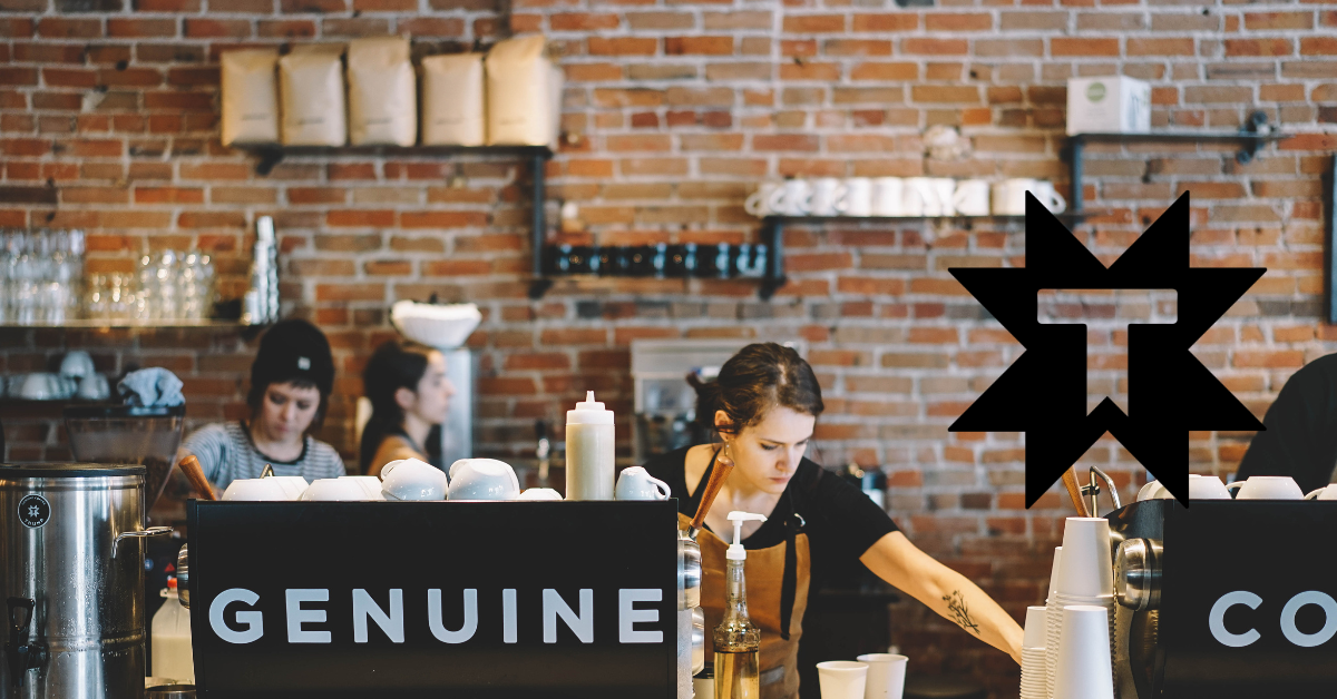
Thump Coffee came to me with an obscure sense of purpose.
The owners had an authentic yet ambiguous understanding of their brand’s purpose. They needed help articulating it clearly so their people could embrace it and their cafe cultures could embody it.

Green State Coffee came to me with an idea and little else.
Their dream was to create the first drive-thru coffee business where every single aspect of the business model was environmentally conscious and sustainability-driven.
Operating with a sustainability ethos in an industry known for waste was a compelling idea, but they needed more.

Spoken Moto came to me with a dream for change.
Although they got their start with a clear and compelling vision, competing staff opinions regarding brand identity and direction became cancerous to the culture.
Tired of the exhaustion that came from this identity crisis, they longed to restore their place in the community as an inclusive hub where all could belong.

City Without Orphans came to me looking for direction.
They had many active initiatives but needed help aligning those initiatives under a common goal. The sad truth is that the needs in the foster care community are many, and the people willing to help are few. They needed help clarifying what their purpose was so people in the community would be moved to action.